
UBC Workplace Learning (WPL): UX and Accessibility Study
The Why
In 2020, the Talent Development team of the University of British Columbia created a learning ecosystem (WPL) as part of its efforts to provide better professional development opportunities to staff members.
Evidence showed that the existing website (a course catalogue) lacks a practical approach to accommodate user preferences (easily finding courses, certificates, or even navigating the platform).
The goal of this project was to: first, understand the experience users are having when using the website, as UX research had never been conducted before, and, second, redesign the website and content to make it more attractive and accessible for learners.
The Solution
Having access to user issues reports and being aware of a few limitations, I decided to complement existing data with a usability test. This allowed me to gain powerful insights into users’ (learners) needs and behaviors. I also reviewed other universities and online learning companies’ websites to evaluate key features, user flows, and general layouts.
All these findings guided my project and helped me provide suggestions to the team, both in terms of UI and web accessibility, and create a prototype of a more user-centered learning catalog.
I presented the project to the Talent Development team in May 2022.
Research
Building upon the user issues reports I gathered for weeks, some interviews I had with the team, and my own knowledge of the University, I came up with three personas that represent the main groups of users of our platform.
With these three types of learners in mind, it was easier to conduct UX research and implement the final redesign changes for the website. It became more obvious that, for this project, we should not only consider UX (user experience) but also LX (learner experience) and even EX (employee experience), as the WPL course catalog is the first point of contact UBC employees have with our professional training.
User and Marketing Personas
Competitive Analysis
Before I started redesigning the platform, I chose to do some competitive research in the education sector. I looked at a few direct and indirect competitors’ websites to experience first-hand how they convey their messages, their UI choices, and the general feeling of their products. Although WPL’s platform is a unique system that serves a precise purpose within the University of British Columbia, I applied some key competitors’ features to the prototype in order to make our course catalog a more welcoming and easier to use tool for learners.

Usability Testing
I interviewed both existing staff members and external users to understand their pain points and general interaction with our website while conducting some general tasks. This was a moderated test consisting of three core goal-based tasks and follow-up questions whose main objective was the obtention of qualitative data.
Tasks
Open-ended questions
Finding out more about WPL and how to use the platform.
Searching and registering for online courses.
Browsing for future live workshops.
Follow-up and general feedback questions.
Insights
Behavioral + Attitudinal data
I discovered several issues that our learners experienced with the platform. Some of them include:
Unclear content and navigation options.
Elements that systematically go unnoticed (carousel, filter).
Unappealing CTAs and icons.
A general ‘unattractive’ feeling.
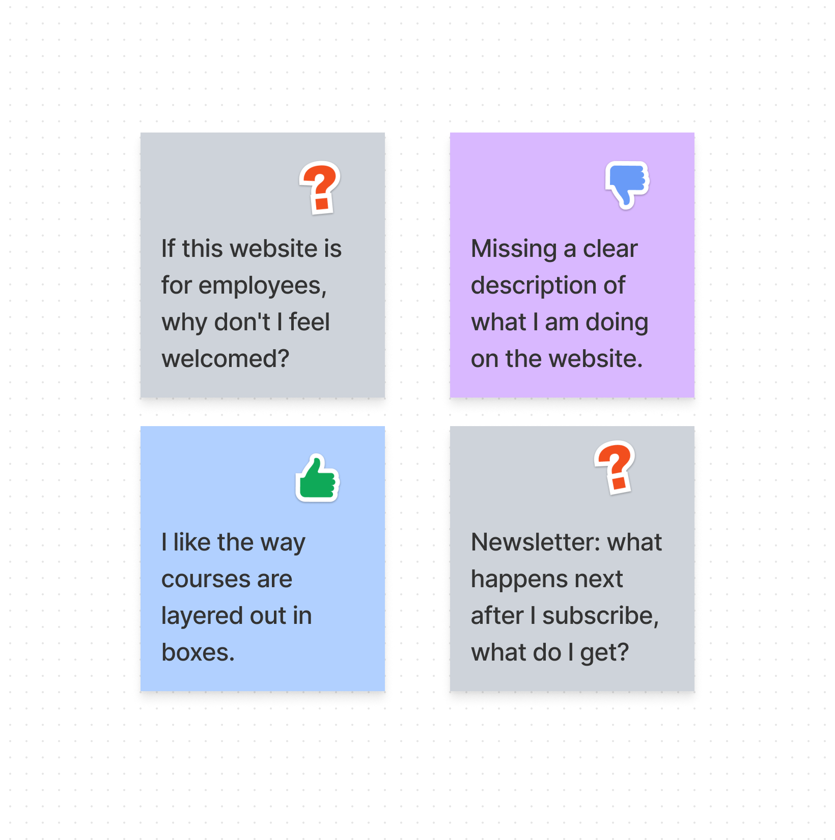
“I would take some courses based on the content, but the design isn’t catching my eye. It feels a bit basic.”
“From a visual point of view, having a $0 sign is not attractive. I have the feeling of being shopping”
“Some design elements are a little inconsistent.”
Accessibility Audit
Checklist
I provided the team with a plan to comply with WCAG and prepare the platform for the use of assistive technology. Some of my recommendations included:
Structural changes (better semantic HTML).
Use of simple and anti-ableist language.
Color and typography guidelines.
Keyboard navigation + focus state.
Good Alt Text for visual elements.
Captions for videos (avoiding any flashing for users prone to seizures).
Others.
Recommendations
I advised thinking of ‘Accessibility’ as an ongoing process. As such, apart from making the changes mentioned before, I suggested for the future:
Appointing an internal auditor to do regular manual testing.
Considering an accessibility audit (external) before launching the redesigned website.
Conducting new usability testing that includes staff members with disabilities, as their unique experiences would provide rich feedback.
Redesign and Iterations
Once I gathered all users’ insights and had a better idea of what similar websites looked like, I created a prototype (low fidelity) to show the potential changes.
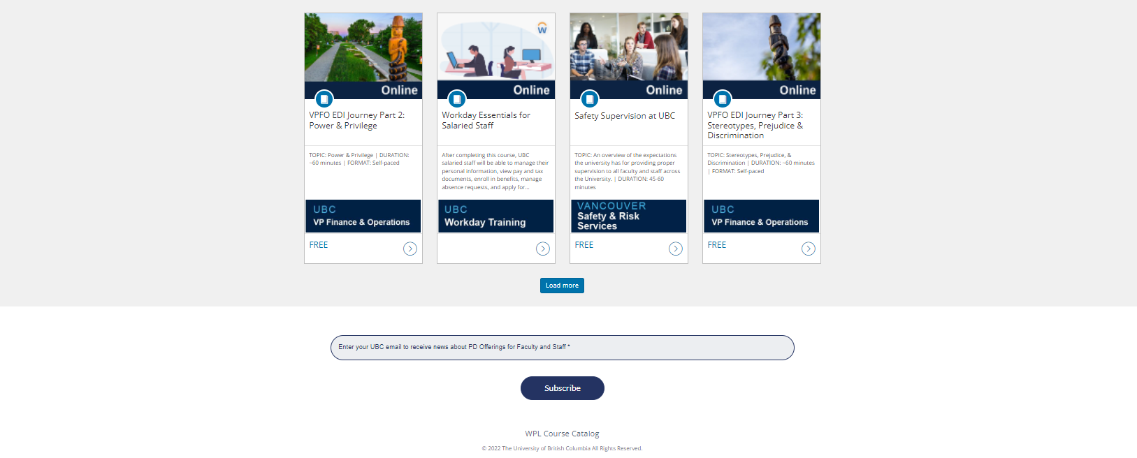
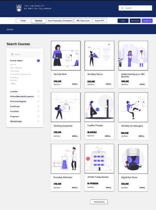
In my redesigned interface, I included basic improvements such as a cleaner and more pragmatic menu, a general search bar, a short description (hero video) of the team’s offerings, clear titles containing important keywords, and a footer menu (with a direct CTA for the Newsletter and an option to report accessibility issues). On the courses page, the filter is automatically displayed and includes more options to refine the search. The ‘About Us’ page now contains four cards with information about the mission and values of the team, as well as instructions on how to use the platform. Also, when learners check out a course, they now get similar course suggestions.
Ultimately, the outcome of this redesign is a website that is intuitive to users. Guiding them to key outcomes through designs that leverage relevant and timely content.
Before
Home Page
Footer

About WPL

Detail of a course
After (prototype)

Home Page
Courses

About WPL

Detail of a course
Current State
WPL’s professional development courses offer is set to keep growing in the near future. My findings were presented to the entire team as a part of my (personal) professional development in order for the managers to obtain ideas on how to redesign the website. My research and suggestions showed the path for UX/LX/EX improvement.
Key Takeaways
A good (or bad) learning experience begins even before we start a course. Although we all learn differently, everybody appreciates it when a learning platform tries to make things easier for us, so we can focus on what really matters: our education.
Understanding what motivates people to learn and what frustrates their attempts to have a good experience should be a priority for teams in the education sector. From poor design choices and a lack of content research, this industry often faces the same issues.
Being more empathetic towards those with disabilities and making sure research is done (often) with the participation of underrepresented groups will make all the difference.